Category Archives: product

This tea is too cool for school

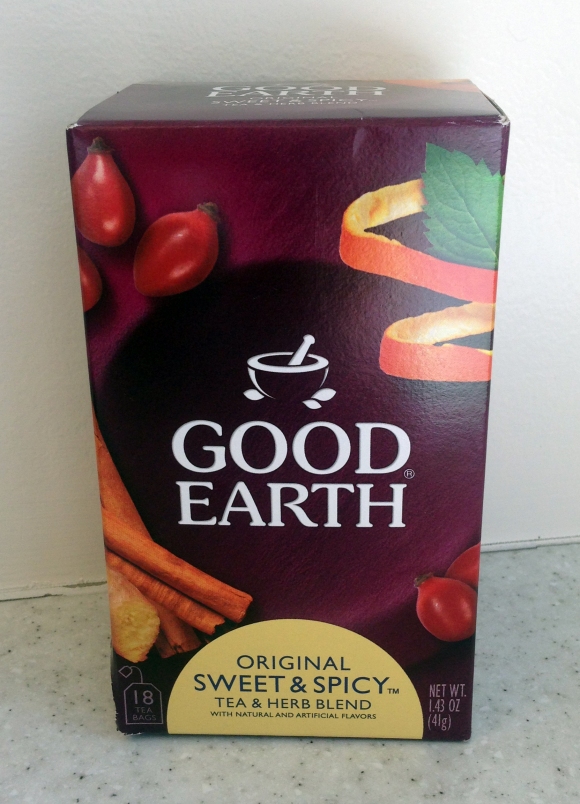
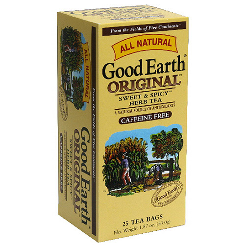
Good package design is like a fine wine: it gets better with age.  Case-in point: Good Earth teas. These delicious teas (what up Original Sweet and Spicy!!!) have gone through their own design evolution, for the better.

In no particular order (mainly because I don’t know which order they go in) here are some of Good Earth’s school pictures:

Keeping it in the ever-innovative neutral color family…

Oh hey deer. You look like you enjoy a fine cup of tea.

Oh hey deer. You look like you enjoy a fine cup of tea.

And then there was the introduction of some color…

0003068483313_500X500

But apparently that pale yellow was too much to handle…so Good Earth tamed it down a bit…

Good-Earth-Original-Tea Bags-18-Count-Boxes

snoozerific

Good Earth then did some soul-searching and came into its own with this classic look. Good design but still not there. Getting closer….

tea

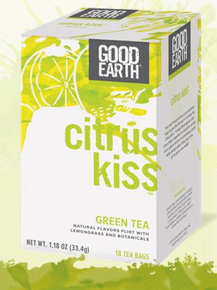
And then BAM!!!! Good Earth got a stylist, learned how to dress for its body type and impressed us all.

cit weet

This most recent design takes Good Earth to the next level, also known as the “you have arrived” level. It’s fresh with its bright colors and brings the often boring category of tea to a place know as the “cool kids table.” While other tea companies stick with stuffy, over-cluttered package designs, Good Earth sets a new tone: bold and beautiful and dare I say, hip.

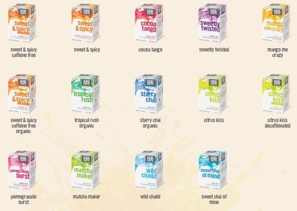
In case you aren’t convinced of Good Earth’s awesomeness, you can see the entire family tree is filled with model-like looks.
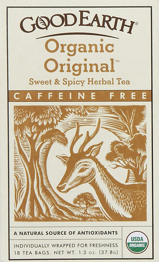
123Good tea + good design = WIN. Way to go, Good Earth.

Glass is Life: B2B that doesn’t suck

B2B (that’s business to business) advertising campaigns tend to be a bit….dry, to put it politely. Granted, many of the subjects, industrial tools, vendor supplies, etc are not the most riveting topics. So when I came across Owens-Illinois’ Glass is Life campaign, I was pleasantly surprised. (Quick background: O-I is the world’s leading manufacturer of glass containers, best known for their glass bottles.)

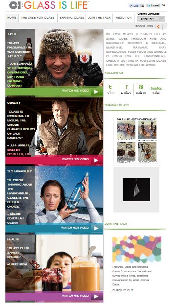
First, let’s look at their website….

o-i

Gorgeous, right?!?! It is completely unexpected. It has a beautiful interface and is a UX dream. The great thing about the microsite (as it isn’t housed on the O-I website) is that it is going beyond the business that buy glass containers. It is “creating influence and ‘market pull’ by appealing to their customer’s customers.” (Cameron, 2013) HOW TRUE! Take me as an example, I’m not in the market to buy thousands of glass bottles, or at least not any time soon. But I was still entertained and enthralled with the Glass is Life website. Why is that? Because Doremus, the agency behind the campaign, did a damn good job of making the website appealing to all. And it brilliantly focuses the conversation on glass, NOT O-I. This makes it feel less “sell sell sell.”

The site also features videos of glass ambassadors, telling why they use glassware. Like this one of entrepreneur Nik Lecloux talking about his use of glassware in his business.

I-O’s core glass beliefs (taste, quality, sustainability, and health) are echoed throughout the campaign. The microsite makes it clear why glass is the container of choice for many. Overall what drew me in was the ease of navigating the website and the beauty in the design. Bottle caps off to O-I for making glass containers interesting!

Karl Zahn’s Menagerie

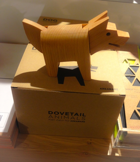
During a recent outing to Crate & Barrel (I’m a sucker for kitchen gadgets) I came across a VERY cool children’s toy. Say hello to Dog.

photo (1)

I am not ashamed to admit it, I wanted Dog for myself. I mean, sure, it is TECHNICALLY a children’s toy, but it could also be a chic home decor piece, right?

Upon some research, aka a few Google searches, I discovered that you CAN teach an old dog new tricks. Dog is a creature from the Dovetail Animals Collection.  He (I’ve decided it’s a “he”) has interchangeable pieces that can be detached and reattached with other animals. To break that down…you could have a dog’s head, an alpaca’s body and an alligator’s tail. For the visual learners, this is how it works:

How cool, right?! After I saw this, I was curious to see if this talented Karl Zahn had designed other awesome things. Answer: YES!

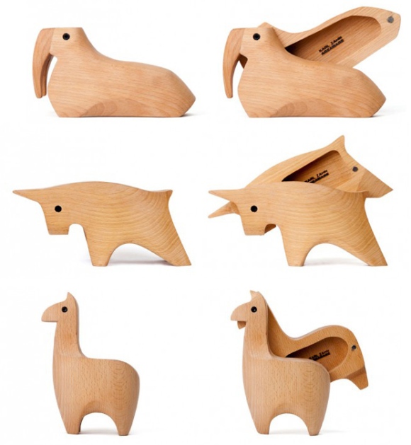
Before the Dovetail Animals Collection rolled onto the scene, Karl Zahn created Animal Boxes.

Yes, those are adorably crafted animals that also can hold tiny treasures. See for yourself:

I love Zahn’s simplistic and modern style. He has some other sweet work on his website. It’s safe to say that I want an entire menagerie of his work.

Gingiber Illustrations

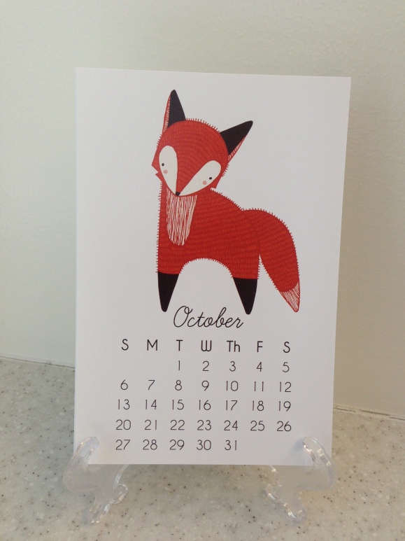
Holy crap! It’s October already. How did that happen? The good news is that I get to switch my desk calendar. Drum roll please…….

TA DA!

fox

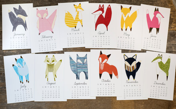
Isn’t it a beaut? I snagged this desk calendar from the Gingiber Etsy shop. The calendar features a whimsical fox every month. It is playful and brightens up my office. Check out all the months, I mean, foxes.

il_570xN.500181699_6ncw

The shop is already selling the 2014 fox calendar. So go buy it.

Gingiber has other great items like prints, pillows, & tote bags “that are sweet enough for children but smart enough for adults.”

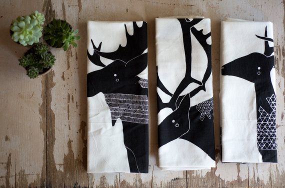
I have a few other favorites from the shop that I think deserve a shout-out. Like this set of 3 Antler Animal Tea Towels, which I think would look cool put in frames and displayed on the wall.

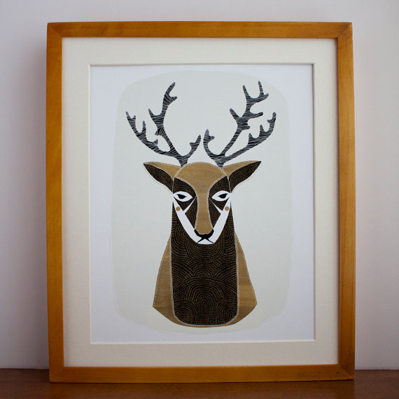
il_570xN.499463948_54u0 Speaking of antlered creatures, this dude has got the “don’t mess with me” look down to a T.

deeeeeeeer

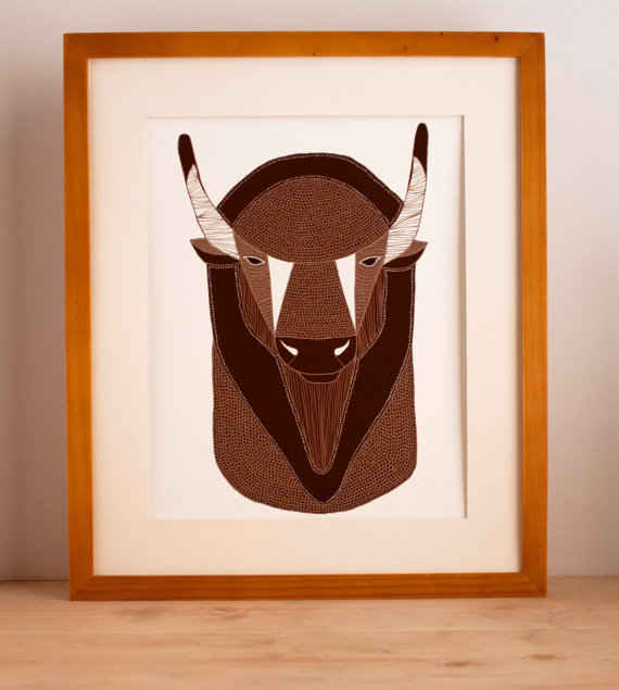
This buffalo print is pretty legit too. He’s just chilling, like no big deal.

buff

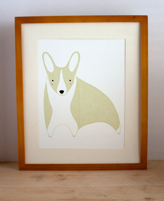
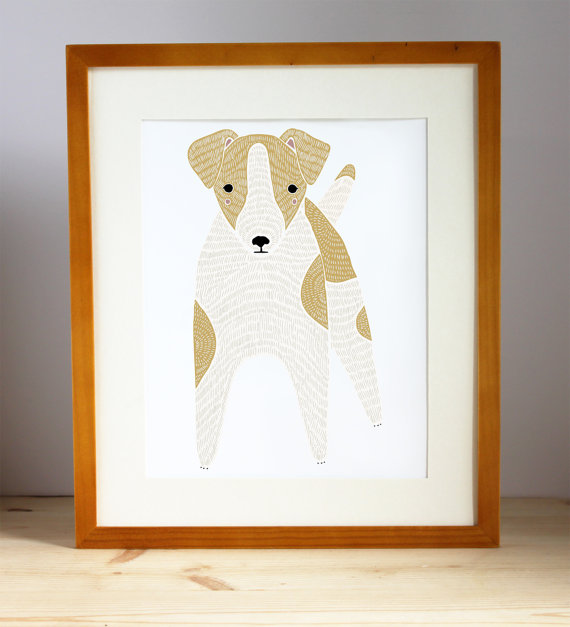
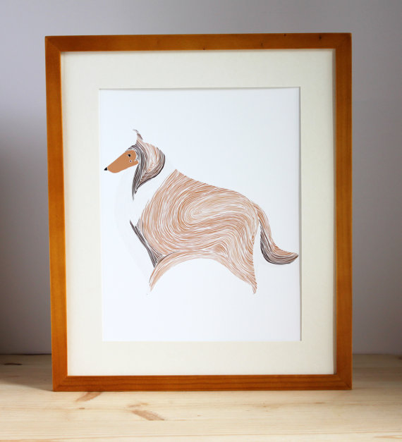
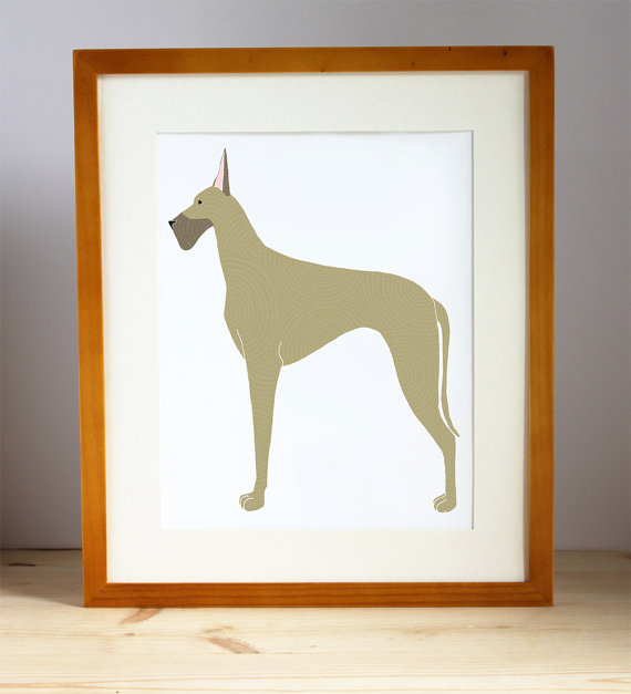
And I can’t forget to mention Gingiber’s 52 Weeks of Dogs Project; it’s awesome. The shop is putting out one dog print per week and the creator, Stacie Bloomfield’s take on man’s best friend are a-mazing. My personal favs:

The Corgi

corgi

The Jack Russell Terrier

jack

The Collie

collie

And The Great Dane

111If these illustrations haven’t convinced you to go check out the Gingiber shop, then you have bigger issues…like finding where your soul went.


The Flavor Thesaurus (or Flavour if you’re a Brit)

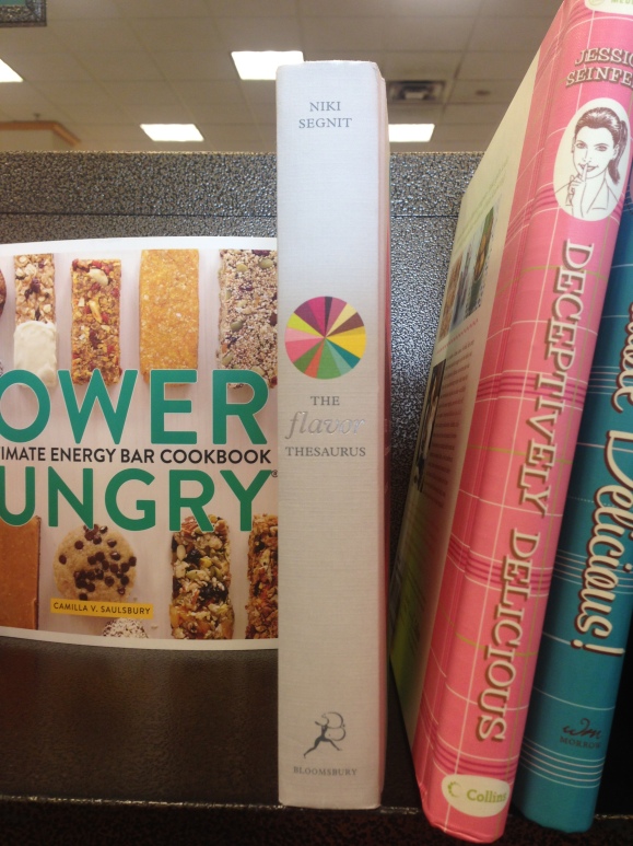
Here I am, perusing the cookbook section at Barnes & Nobles, minding my own business, when all-of-a-sudden…BAM! The Flavor Thesaurus grabs my attention like it is the Queen of England. It’s looking all fly with its clean white spine, silver font and color wheel.

photo 2

Okay, FINE. I’ll take the bait, Flavor Thesaurus.  I’ll take you off the shelf.

photo 1

DA-AAAAMN. You look goooooooood. This is what a book cover should look like: an attention-grabbing design that isn’t trying too hard. It is GORGEOUS. Well done Niki Segnit for choosing whoever designed your book cover. He/she deserves the André Simon Award of book cover design.

Watch your back, staples.

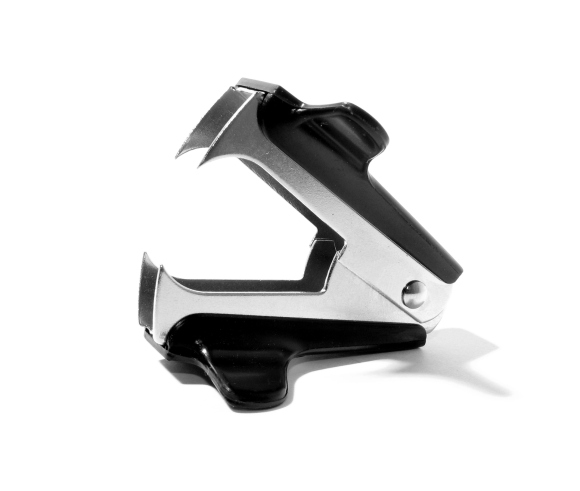
You know what’s boring? The average stapler remover:

Snooze Fest 2013

Snooze Fest 2013

If I’m going to be chained to a desk all day, why not make the tools I use a little more awesome?

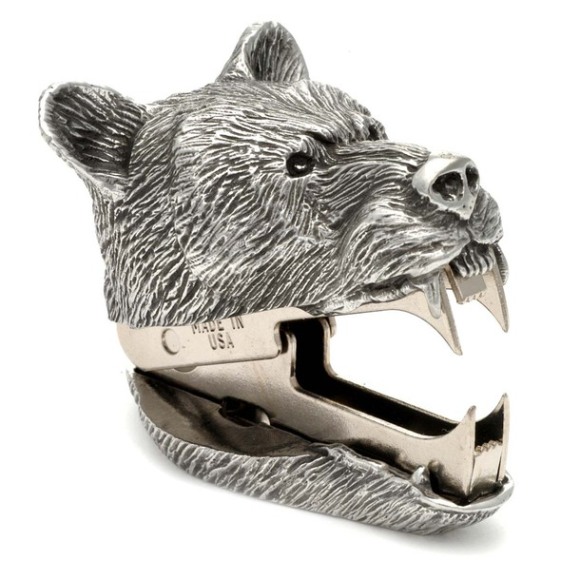
Fab.com enters stage left)

I present to you the most epic stapler remover of the 21st century!

I can already picture myself exclaiming “RAAAAAAAAAAAWR” every time a staple gets removed. This product design is not only FABulous but it brings a little bit of the great outdoors into the not-so-great indoors.

Well done, Swedes.

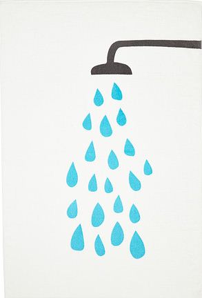
They did it again. IKEA makes something I want to buy. I just spotted this terry cloth towel and fell in love with the design.

towel

TVINGEN is what this little number goes by…and even though I can’t pronounce it’s name, I’m sure we’d have no trouble being BFFs. Designed by the talented Anna Salander, the look of this towel is clean, yet playful. If it came in a print form, I’d probably frame it and put in on my wall. Way to go Swedes, with your bold and eye-catching designs. You sure know how to make an appealing product.